Run Optimization and Create Paper Figures
figures.RmdOptimization
The estimate_shenzhen function estimates the sensitivity at a given time from crossing a critical viral load threshold, k, and time from symptom onset, t. It will be used to approximate the Shenzhen test sensitivity data.
estimate_shenzhen <- function(k, t, shape_y, shape_a, rate_a, rate) {
  dgamma(k, shape_y, rate) *
    get_fnr(time = k + t, shape = shape_a, rate = rate_a)
}
The diff_shenzhen function integrates over estimate_shenzhen from 0 to \(\infty\) with respect to k, the time from crossing the critical viral threshold for a given time from symptom onset, t. It then subtracts this estimate from the test sensitivity indexed at symptom onset reported by the Shenzhen model.
diff_shenzhen <- function(t, shape_a, rate_a, shape_y, rate) {
  integrate(estimate_shenzhen, 0, Inf, t = t, shape_a = shape_a,
            rate_a = rate_a, shape_y = shape_y, rate = rate)$value -
    get_shenzhen_estimate(t)
}
The er function is the function that is minimized by the optimization function. It includes the squared difference between the model sensitivity estimates and the Shenzhen estimates from 8 days prior to symptom onset through 7 days post-symptom onset, as well as the squared difference between the estimated shape of the infectiousness gamma distribution and the shape derived from the empirical data put forth by the McAloon et al. meta analysis. This function is attempting to simultaneously find optimal estimates for the shape and rate of a gamma distribution used to estimate the test sensitivity indexed on time of crossing the critical viral threshold (shape_a and rate_a), as well as the shape of the distribution of time from infection to crossing the critical viral threshold (shape_x) and the shape of the distribution of time from crossing the critical viral threshold to symptom onset (shape_y).
er <- function(x, shape, rate) {
  shape_a <- x[1]
  rate_a <- x[2]
  shape_y <- x[3]
  shape_x <- x[4]
  sum(map_dbl(seq(-8, 7, 1), diff_shenzhen, shape_a = shape_a,
              rate_a = rate_a, shape_y = shape_y, rate = rate)^2) +
    ((shape_y + shape_x) - shape)^2
}
The run_optimization function first finds a gamma distribution that best fits the log normal distribution proposed by McAloon et al. It then uses the shape and rate of this distribution in the optimization function, minimizing the er function described above. The nmkb function is an implementation of the Nelder-Mead algorithm for derivative-free optimization that allows bounds to be placed on parameters. Finally, a data frame with results is output.
run_optimization <- function() {
  fit_incubation <- fitdistrplus::fitdist(
    rlnorm(10000, rnorm(1, 1.63, 0.06122), rnorm(1, 0.5, 0.0255102)), "gamma")

  o <- nmkb(c(2.3, 0.2, 0.5, 0.5), er,
            lower = c(1, 0.1, 0.1, 0.1),
            rate = fit_incubation$estimate[2],
            shape = fit_incubation$estimate[1])

  data.frame(
    shape_a = o$par[1],
    rate_a = o$par[2],
    shape_y = o$par[3],
    shape_x = o$par[4],
    shape_sym = fit_incubation$estimate[1],
    rate_sym = fit_incubation$estimate[2],
    error = o$value[1]
  )
}
run_optimization <- possibly(run_optimization,
                             otherwise = data.frame(
                               shape_a = NA,
                               rate_a = NA,
                               shape_y = NA,
                               shape_x = NA,
                               shape_sym = NA,
                               rate_sym = NA,
                               error = NA
                             ))
The code below runs the run_optimization function 5,000 times, saving the output to a large data frame called out.
sims <- 5000

set.seed(1)
out <- map_df(1:sims, ~run_optimization())
out %>%
  summarise(shape_a_mean = mean(shape_a),
            shape_a_sd = sd(shape_a),
            rate_a_mean = mean(rate_a),
            rate_a_sd = sd(rate_a),
            shape_y_mean = mean(shape_y),
            shape_y_sd = sd(shape_y),
            shape_x_mean = mean(shape_x),
            shape_x_sd = sd(shape_x),
            rate_mean = mean(rate_sym),
            rate_sd = sd(rate_sym),
            sym_mean = mean(shape_sym),
            .groups = "drop") -> out_sum
knitr::kable(out_sum)| shape_a_mean | shape_a_sd | rate_a_mean | rate_a_sd | shape_y_mean | shape_y_sd | shape_x_mean | shape_x_sd | rate_mean | rate_sd | sym_mean |
|---|---|---|---|---|---|---|---|---|---|---|
| 2.250097 | 0.3992711 | 0.2137284 | 0.0389069 | 2.091456 | 0.7466036 | 2.093612 | 0.4981271 | 0.7269191 | 0.0939308 | 4.189122 |
Figure S1
The code below takes the incubation distribution results from McAloon et al. and plots them to compare our model estimates of the incubation period to.
incubation <- tibble(
  x = rep(seq(0, 14, by = 0.1), sims),
  y = dlnorm(x, rnorm(sims, 1.63, 0.06122), rnorm(sims, 0.50, 0.0255102))
) %>%
  group_by(x) %>%
  summarise(m = median(y),
            lcl = quantile(y, 0.025),
            ucl = quantile(y, 0.975),
            .groups = "drop")
incubation_plot <- incubation %>%
  ggplot(aes(x, m)) +
  geom_line(color = "orange") +
  geom_ribbon(aes(ymin = lcl, ymax = ucl), color = NA, alpha = 0.25, fill = "orange") +
  labs(x = "Time from infection to symptom onset",
       y = "Density") +
  theme_minimal() +
  theme(panel.grid = element_blank(),
        axis.line = element_line(),
        axis.ticks = element_line())
The code below extracts the Shenzhen model estimates for test sensitivity and plots them for comparison to our model estimates.
shenzhen_sensitivity <- tibble(
  x = rep(seq(-8, 7, by = 0.1), sims),
  y = map_dbl(x, get_shenzhen_estimate)
) %>%
  group_by(x) %>%
  summarise(m = 1 - median(y),
            lcl = 1 - quantile(y, 0.025),
            ucl = 1 - quantile(y, 0.975),
            .groups = "drop")
shenzhen_sensitivity_p <-
  shenzhen_sensitivity %>%
  ggplot(aes(x, m)) +
  geom_line(color = "orange") +
  geom_ribbon(aes(ymin = lcl, ymax = ucl), color = NA, alpha = 0.25, fill = "orange") +
  labs(x = "Time from symptom onset",
       y = "Sensitivity") +
  theme_minimal() +
  theme(panel.grid = element_blank(),
        axis.line = element_line(),
        axis.ticks = element_line())
The code below takes the output from the optimization function and creates a plot of the time from infection to crossing the critical viral threshold.
exposure_to_threshold <- tibble(
  x = rep(seq(0, 14, 0.1), sims),
  y = dgamma(x, shape = out$shape_x, rate = out$rate_sym)
) %>%
  group_by(x) %>%
  summarise(m = median(y),
            lcl = quantile(y, 0.025),
            ucl = quantile(y, 0.975),
            .groups = "drop") %>%
  ggplot(aes(x, m)) +
  geom_line(color = "cornflower blue") +
  geom_ribbon(aes(ymin = lcl, ymax = ucl), alpha = 0.25, color = NA, fill = "cornflower blue") +
  coord_cartesian(ylim = c(0, 1)) +
  labs(x = "Infection to threshold",
       y = "Density") +
  theme_minimal() +
  theme(panel.grid = element_blank(),
        axis.line = element_line(),
        axis.ticks = element_line())
The code below takes the output from the optimization function and creates a plot of the time from crossing the critical viral threshold to symptom onset.
threshold_to_symtpoms <- tibble(
  x = rep(seq(0, 14, 0.1), sims),
  y = dgamma(x, shape = out$shape_y, rate = out$rate_sym)
) %>%
  group_by(x) %>%
  summarise(m = median(y),
            lcl = quantile(y, 0.025),
            ucl = quantile(y, 0.975),
            .groups = "drop") %>%
  ggplot(aes(x, m)) +
  geom_line(color = "cornflower blue") +
  geom_ribbon(aes(ymin = lcl, ymax = ucl), alpha = 0.25, color = NA, fill = "cornflower blue") +
  coord_cartesian(ylim = c(0, 1)) +
  labs(x = "Threshold to symptom onset",
       y = "Density") +
  theme_minimal() +
  theme(panel.grid = element_blank(),
        axis.line = element_line(),
        axis.ticks = element_line())
The code below takes the output from the optimization function and calculates the test sensitivity to compare to the Shenzhen data.
get_sensitivity_sym <- function(t, shape_a, rate_a, shape_y, rate) {
  integrate(estimate_shenzhen, 0, Inf, t = t, shape_a = shape_a,
            rate_a = rate_a, shape_y = shape_y, rate = rate)$value
}

params <- tibble(
  shape_a = out$shape_a,
  rate_a = out$rate_a,
  shape_y = out$shape_y,
  rate = out$rate_sym
)
params <- expand_grid(
  t = seq(-8, 7, 0.1),
  params
)
sensitivity <- params %>%
  mutate(sens = pmap_dbl(params, get_sensitivity_sym))
params <- tibble(
  shape = out$shape_a,
  rate = out$rate_a
)

params <- expand_grid(
  t = seq(0, 14, 0.1),
  params
)
sens <- params %>%
  mutate(y = pmap_dbl(params, get_sensitivity)) %>%
  group_by(t) %>%
  summarise(m = median(y),
            lcl = quantile(y, 0.025),
            ucl = quantile(y, 0.975),
            .groups = "drop")
The code below takes takes the inferred sensitivity from above and plots it.
sensitivity_summ <- sensitivity %>%
  group_by(t) %>%
  summarise(m = 1 - median(sens),
            lcl = 1 - quantile(sens, 0.025),
            ucl = 1 - quantile(sens, 0.975),
            .groups = "drop")
inferred_sensitivity <- sens %>%
  ggplot(aes(t, m)) +
  geom_line(color = "cornflower blue") +
  geom_ribbon(aes(ymin = lcl, ymax = ucl), alpha = 0.25, color = NA, fill = "cornflower blue") +
  labs(x = "Time from threshold",
       y = "Sensitivity") +
  theme_minimal() +
  theme(panel.grid = element_blank(),
        axis.line = element_line(),
        axis.ticks = element_line())
The code below takes the output from the optimization function and estimates the incubation period.
incubation_inferred <- tibble(
  t = rep(seq(0, 14, 0.1), sims),
  y = dgamma(t, shape = out$shape_x + out$shape_y, rate = out$rate_sym),
) %>%
  group_by(t) %>%
  summarise(m = median(y),
            lcl = quantile(y, 0.025),
            ucl = quantile(y, 0.975),
            .groups = "drop")
The code below combines all figures into a single plot, comparing the empirical estimates to our model estimates.
library(patchwork)
incubation_plot <- incubation_plot +
  geom_line(data = incubation_inferred, aes(t, m), color = "cornflower blue", lty = 2)

shenzhen_sensitivity_p <- shenzhen_sensitivity_p +
  geom_line(data = sensitivity_summ, aes(t, m), color = "cornflower blue", lty = 2)

(incubation_plot | shenzhen_sensitivity_p) / (exposure_to_threshold | threshold_to_symtpoms |  inferred_sensitivity) +
  plot_annotation(tag_levels = 'A')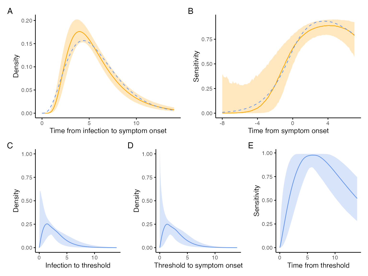
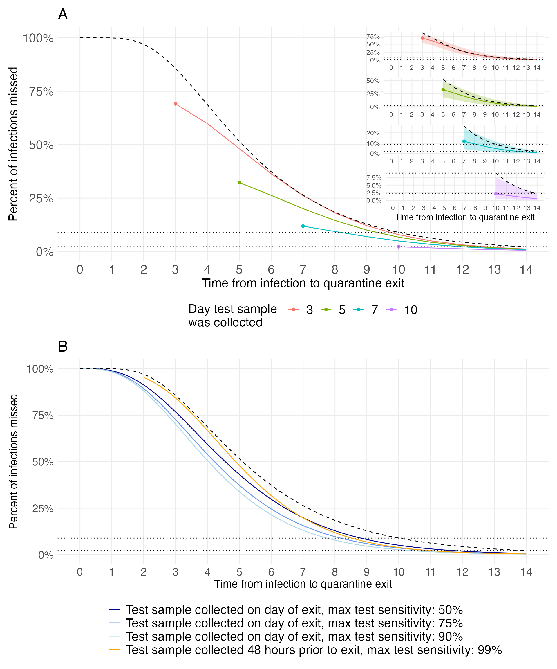
Figure 2
The code below takes the output from the optimization above and estimates the proportion of infections missed.
sims <- nrow(out)
set.seed(1)

params <- tibble(
  id = 1:sims,
  shape_fnr = out$shape_a,
  rate_fnr = out$rate_a,
  shape_exposure_to_threshold = out$shape_x,
  shape_threshold_to_symptoms = out$shape_y,
  rate = out$rate_sym
)
vals <- expand_grid(
  test_time = c(3, 5, 7, 10),
  additional_quarantine_time = 0:14,
  id = 1:sims
) %>%
  filter(test_time + additional_quarantine_time <= 14) %>%
  left_join(params, by = "id") %>%
  select(-id)

d <- vals %>%
  mutate(p = pmap_dbl(vals, possibly(get_prob_missed_infection, otherwise = NA)),
         qt = test_time + additional_quarantine_time)
d %>%
  group_by(test_time, additional_quarantine_time, qt) %>%
  summarise(m_p = median(p, na.rm = TRUE),
            mean_p = mean(p, na.rm = TRUE),
            lcl_p = quantile(p, 0.025, na.rm = TRUE),
            ucl_p = quantile(p, 0.975, na.rm = TRUE),
            .groups = "drop") -> d_summ
The remaining code creates Figure 2.
d_summ %>%
  filter(additional_quarantine_time == 0) -> d_test_time
f2 <- d_summ %>%
  ggplot(aes(x = qt, y = m_p, color = as.factor(test_time))) +
  geom_line() +
  geom_point(data = d_test_time) +
  geom_line(data =
              data.frame(x = seq(0, 14, 0.1),
                         y = plnorm(seq(0, 14, 0.1), 1.63, 0.5, lower.tail = FALSE)),
            aes(x = x, y = y), color = "black", lty = 2) +
  scale_x_continuous(breaks = 0:14, limits = c(0, 14)) +
  scale_y_continuous(labels = scales::percent) +
  geom_hline(yintercept = c(0.089, 0.022), lty = 3) +
  theme_minimal() +
  labs(x = "Time from infection to quarantine exit",
       y = "Percent of infections missed",
       color = "Day test sample \nwas collected",
       fill = "Day test sample \nwas collected",
       title = "A") +
  theme(panel.grid.minor = element_blank(),
        legend.position = "bottom",
        axis.text = element_text(size = 16),
        axis.title = element_text(size = 16),
        plot.title = element_text(size = 20),
        legend.title = element_text(size = 16),
        legend.text = element_text(size = 16))
f2_3 <- d_summ %>%
  filter(test_time == 3) %>%
  ggplot(aes(x = qt, y = m_p, color = as.factor(test_time))) +
  geom_line() +
  geom_point(data = d_test_time %>% filter(test_time == 3)) +
  geom_ribbon(aes(ymin = lcl_p, ymax = ucl_p, fill = as.factor(test_time)), alpha = 0.25, color = NA) +
  geom_line(data = data.frame(x = 3:14, y = plnorm(3:14, 1.63, 0.5, lower.tail = FALSE)),
            aes(x = x, y = y), color = "black", lty = 2) +
  scale_x_continuous(breaks = 0:14, limits = c(0, 14)) +
  scale_y_continuous(labels = scales::percent) +
  geom_hline(yintercept = c(0.089, 0.022), lty = 3) +
  theme_minimal() +
  labs(x = "",
       y = "") +
  theme(panel.grid.minor = element_blank(),
        legend.position = "none",
        panel.background = element_rect(fill = "white", color = "white"))
f2_5 <- d_summ %>%
  filter(test_time == 5) %>%
  ggplot(aes(x = qt, y = m_p, color = as.factor(test_time))) +
  geom_line(color = "#7CAE00") +
  geom_point(data = d_test_time %>% filter(test_time == 5), color = "#7CAE00") +
  geom_ribbon(aes(ymin = lcl_p, ymax = ucl_p, fill = as.factor(test_time)), fill = "#7CAE00", alpha = 0.25, color = NA) +
  geom_line(data = data.frame(x = 5:14, y = plnorm(5:14, 1.63, 0.5, lower.tail = FALSE)),
            aes(x = x, y = y), color = "black", lty = 2) +
  scale_x_continuous(breaks = 0:14, limits = c(0, 14)) +
  scale_y_continuous(labels = scales::percent, breaks = c(0, 0.25, 0.5)) +
  geom_hline(yintercept = c(0.089, 0.022), lty = 3) +
  theme_minimal() +
  labs(x = "",
       y = "") +
  theme(panel.grid.minor = element_blank(),
        legend.position = "bottom",
        panel.background = element_rect(fill = "white", color = "white"))
f2_7 <- d_summ %>%
  filter(test_time == 7) %>%
  ggplot(aes(x = qt, y = m_p, color = as.factor(test_time))) +
  geom_line(color = "#00BFC4") +
  geom_point(data = d_test_time %>% filter(test_time == 7), color = "#00BFC4") +
  geom_ribbon(aes(ymin = lcl_p, ymax = ucl_p, fill = as.factor(test_time)), fill = "#00BFC4", alpha = 0.25, color = NA) +
  geom_line(data = data.frame(x = 7:14, y = plnorm(7:14, 1.63, 0.5, lower.tail = FALSE)),
            aes(x = x, y = y), color = "black", lty = 2) +
  scale_x_continuous(breaks = 0:14, limits = c(0, 14)) +
  scale_y_continuous(labels = scales::percent) +
  geom_hline(yintercept = c(0.089, 0.022), lty = 3) +
  theme_minimal() +
  labs(x = "",
       y = "") +
  theme(panel.grid.minor = element_blank(),
        legend.position = "bottom",
        panel.background = element_rect(fill = "white", color = "white"))
f2_10 <- d_summ %>%
  filter(test_time == 10) %>%
  ggplot(aes(x = qt, y = m_p, color = as.factor(test_time))) +
  geom_line(color = "#C77CFF") +
  geom_point(data = d_test_time %>% filter(test_time == 10), color = "#C77CFF") +
  geom_ribbon(aes(ymin = lcl_p, ymax = ucl_p, fill = as.factor(test_time)), fill = "#C77CFF", alpha = 0.25, color = NA) +
  geom_line(data = data.frame(x = 10:14, y = plnorm(10:14, 1.63, 0.5, lower.tail = FALSE)),
            aes(x = x, y = y), color = "black", lty = 2) +
  scale_x_continuous(breaks = 0:14, limits = c(0, 14)) +
  scale_y_continuous(labels = scales::percent) +
  geom_hline(yintercept = c(0.089, 0.022), lty = 3) +
  theme_minimal() +
  labs(x = "Time from infection to quarantine exit",
       y = "") +
  theme(panel.grid.minor = element_blank(),
        legend.position = "bottom",
        panel.background = element_rect(fill = "white", color = "white"))
vals <- expand_grid(
  shape_fnr = out_sum$shape_a_mean,
  rate_fnr = out_sum$rate_a_mean,
  shape_threshold_to_symptoms = out_sum$shape_y_mean,
  shape_exposure_to_threshold = out_sum$shape_x_mean,
  rate = out_sum$rate_mean,
  test_time = seq(0, 14, by = 0.1),
  additional_quarantine_time = c(0, 2),
  max_sensitivity = c(0.99, 0.90, 0.75, 0.5),
)

compare_sens <- vals %>%
  mutate(p = pmap_dbl(vals, possibly(get_prob_missed_infection, otherwise = NA)),
         qt = test_time + additional_quarantine_time)
compare_sens %>%
  group_by(test_time, additional_quarantine_time, qt, max_sensitivity) %>%
  summarise(m_p = median(p, na.rm = TRUE),
            mean = mean(p, na.rm = TRUE),
            lcl = quantile(p, 0.025, na.rm = TRUE),
            ucl = quantile(p, 0.975, na.rm = TRUE),
            .groups = "drop") -> compare_sens_summ
compare_sens_summ %>%
  filter(additional_quarantine_time %in% c(0, 2))
## # A tibble: 1,128 x 8
## test_time additional_quarantin… qt max_sensitivity m_p mean lcl ucl
## <dbl> <dbl> <dbl> <dbl> <dbl> <dbl> <dbl> <dbl>
## 1 0 0 0 0.5 1.00 1.00 1.00 1.00
## 2 0 0 0 0.75 1.00 1.00 1.00 1.00
## 3 0 0 0 0.9 1.00 1.00 1.00 1.00
## 4 0 0 0 0.99 1.00 1.00 1.00 1.00
## 5 0 2 2 0.5 0.952 0.952 0.952 0.952
## 6 0 2 2 0.75 0.952 0.952 0.952 0.952
## 7 0 2 2 0.9 0.952 0.952 0.952 0.952
## 8 0 2 2 0.99 0.952 0.952 0.952 0.952
## 9 0.1 0 0.1 0.5 1.00 1.00 1.00 1.00
## 10 0.1 0 0.1 0.75 1.00 1.00 1.00 1.00
## # … with 1,118 more rows
f3 <- compare_sens_summ %>%
  filter((additional_quarantine_time == 2 & max_sensitivity == 0.99) | (additional_quarantine_time == 0 & max_sensitivity %in% c(0.5, 0.75, 0.90))) %>%
  ggplot(aes(x = qt, y = m_p)) +
  geom_line(aes(color = as.factor(max_sensitivity))) +
  geom_line(
    data =
      data.frame(x = seq(0, 14, 0.1),
                 y = plnorm(seq(0, 14, 0.1), 1.63, 0.5, lower.tail = FALSE)),
    aes(x = x, y = y), color = "black", lty = 2) +
  scale_x_continuous(breaks = 0:14, limits = c(0, 14)) +
  scale_y_continuous(labels = scales::percent) +
  geom_hline(yintercept = c(0.089, 0.022), lty = 3) +
  theme_minimal() +
  scale_color_manual("", values = c("dark blue", "cornflower blue", "light blue", "orange"),
                     labels = c(
                       "Test sample collected on day of exit, max test sensitivity: 50%",
                       "Test sample collected on day of exit, max test sensitivity: 75%",
                       "Test sample collected on day of exit, max test sensitivity: 90%",
                       "Test sample collected 48 hours prior to exit, max test sensitivity: 99%")) +
  labs(x = "Time from infection to quarantine exit",
       y = "Percent of infections missed",
       title = "B") +
  theme(panel.grid.minor = element_blank(),
        legend.position = "bottom",
        axis.text = element_text(size = 14),
        axis.title = element_text(size = 14),
        plot.title = element_text(size = 20),
        legend.text = element_text(size = 16)) +
  guides(colour = guide_legend(nrow = 4))
(f2 + inset_element(f2_3, left = 0.6, bottom = 0.75, right = 1, top = 1) +
   inset_element(f2_5, left = 0.6, bottom = 0.55, right = 1, top = 0.8) +
   inset_element(f2_7, left = 0.6, bottom = 0.35, right = 1, top = 0.6) +
   inset_element(f2_10, left = 0.6, bottom = 0.15, right = 1, top = 0.4)) /
  f3 + plot_layout(heights = c(2, 1.75))